Hello everyone!
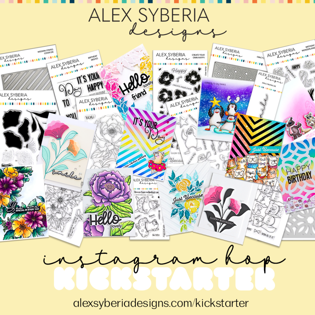
Have you hopped along at the Alex Syberia Designs Kickstarter Campaign blog hop 1 ? Today we’re celebrating the Kickstarter Campaign with an Instagram Hop!
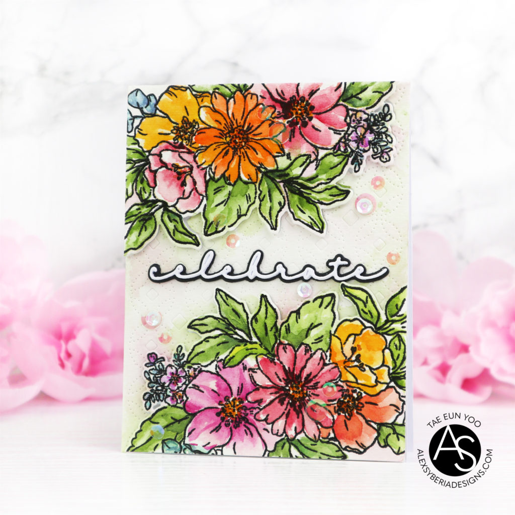
On the blog hop I shared a card showcasing the Life is Good product suite for which I used the coordinating stencils for coloring. For today’s card I watercolored the Life is Good image. To create the background I used the Fancy Cover die.
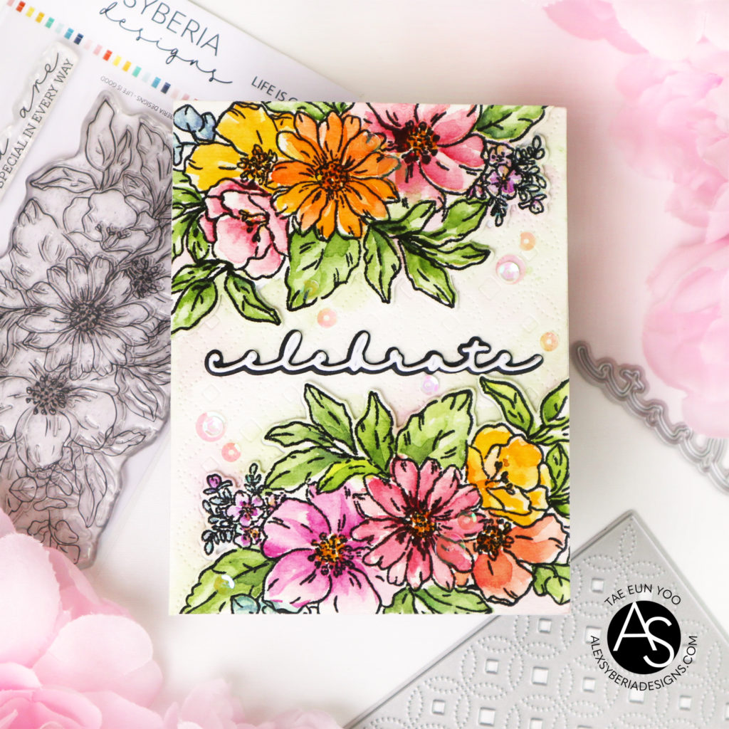
To start I stamped the Life is Good image on the top and bottom of an A2 sized watecolor paper. Actually I wanted to color the floral bunches in no line watercoloring style. So I stamped the images in Antique Linen DI and watercolored them and also the background. But after the coloring was done, I wasn’t happy with the result and decided to stamp the outline in black again. I stamped the images in a black pigment ink and clear heat embossed them.
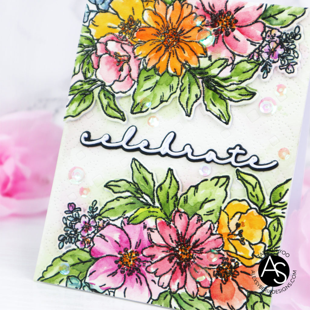
I die cut both floral clusters using the coordinating die and dry embossed the background part using the Fancy cover die. I adhered the background piece on a white cardbase and foam mounted the floral clusters onto their original places.
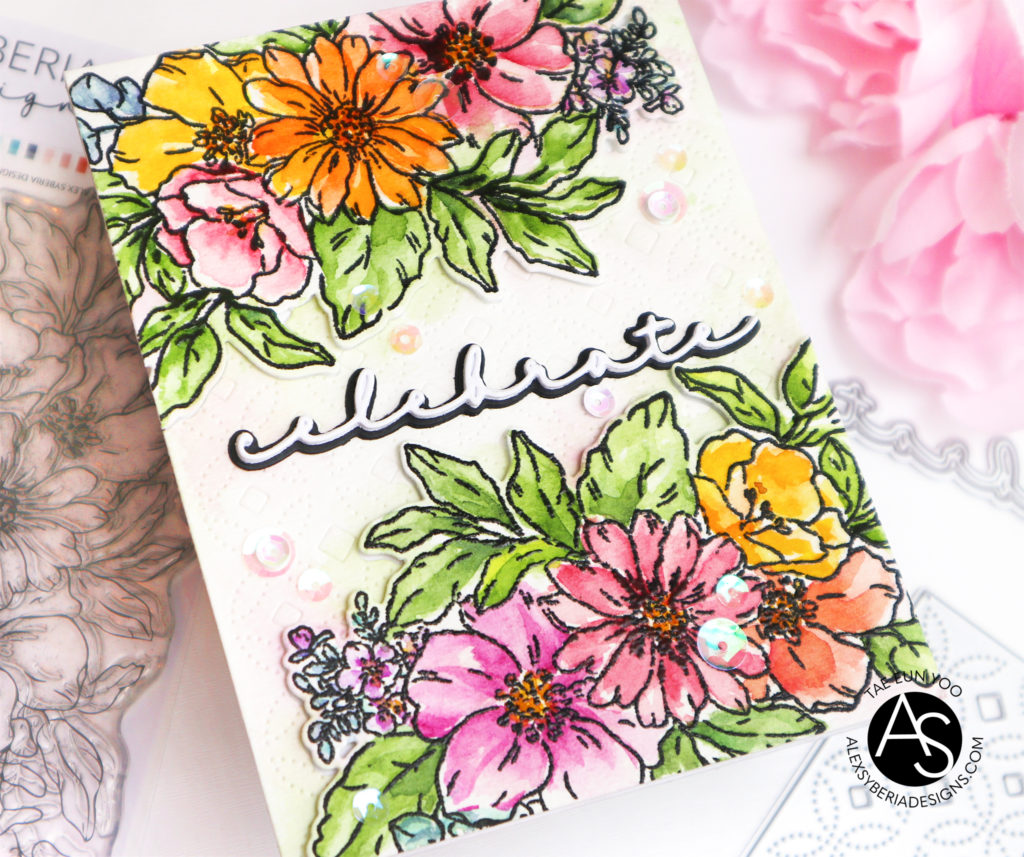
The Celebrate was cut four times from white cardstock and layered. I cut the shadow layer from some black cardstock and added the sentiment to the card. To finish off I scattered a few white and clear iridescent sequins.
To join the Instagram hop please head on over to Instagram! Hop along to get all the inspiration and a chance to win the prizes! There are tons of them 🙂 !
Thank you so much for stopping by today! Hope you like my card !
Hugs,
TaeEun

Such a pretty floral image created by Alex and beautifully coloured by you TaeEun, and you added the outlines afterwards in black so brilliantly, and love the cover die patterned background and the added sentiment looks perfect with the black shadow which makes it stand out so well. x