
Hi everyone! I hope you’re having a great week so far! Can you believe it’s already March? One sixth of the year is already behind us — time truly flies! 😊
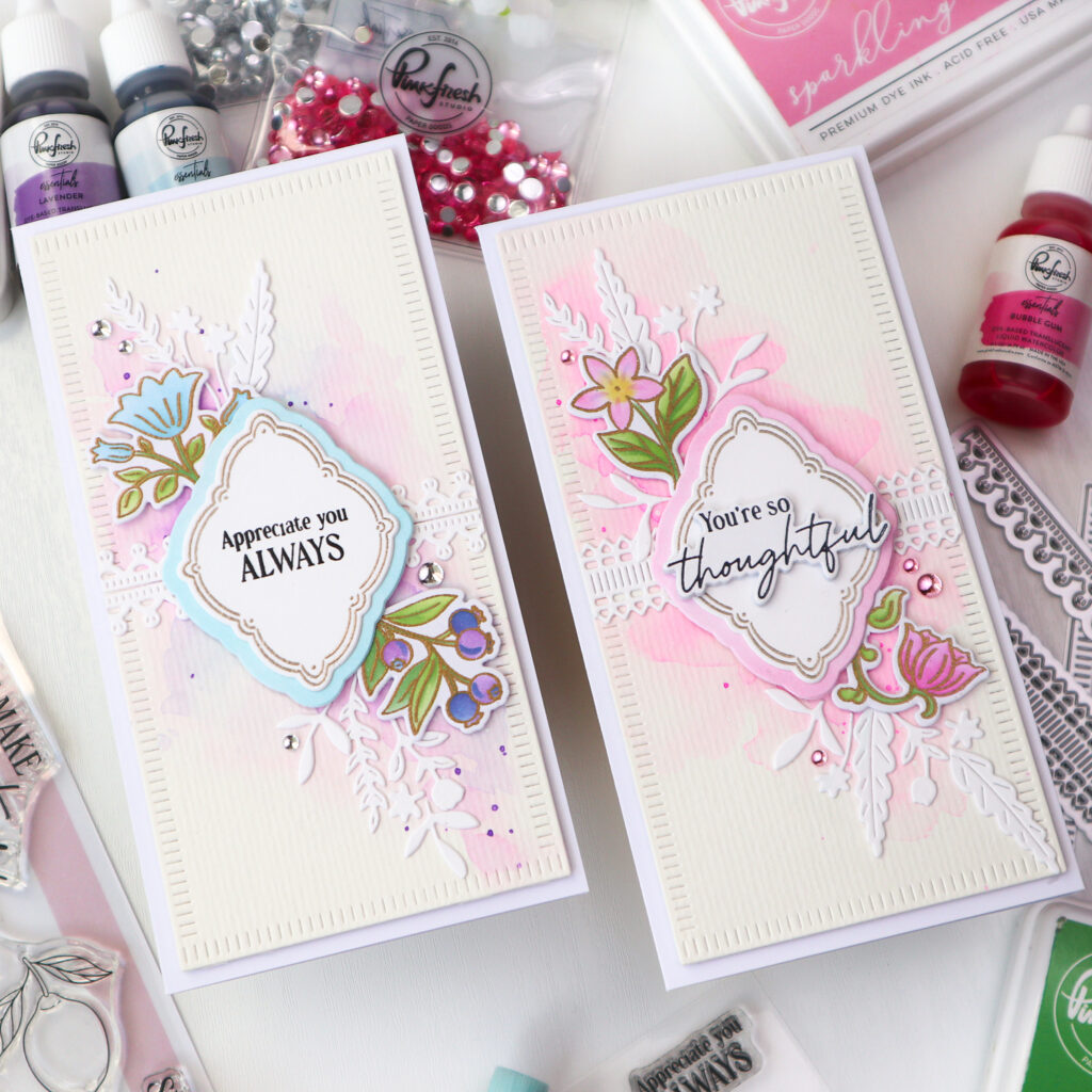
Today I’m on Pinkfresh Studio blog sharing two soft and elegant mini slimline cards created using the same layout. Product suites such as Freshly Picked and Cottage Frames include multiple elements with similar designs that can easily be mixed and matched. Once you design a layout you love, simply swap florals, frames, or sentiments to create a cohesive card set with variety. I also created coordinating watercolor backgrounds for the focal elements to enhance the overall natural and elegant look of the cards.
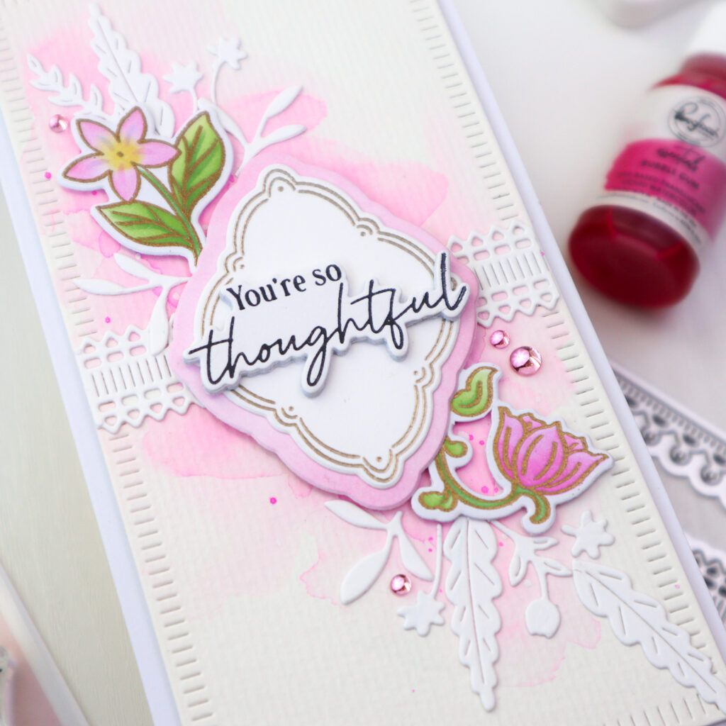
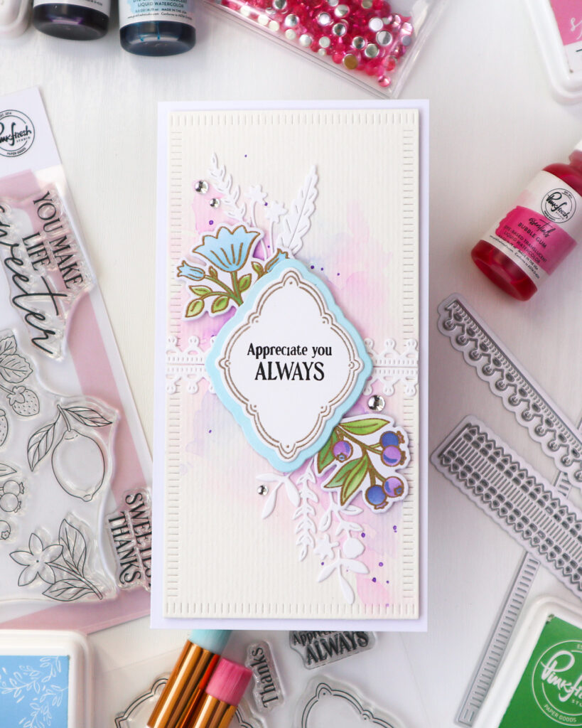
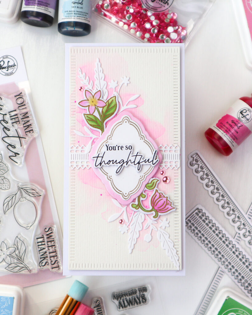
I started by stamping the Freshly Picked floral images in clear embossing ink and heat embossing them in gold. I then colored the images using the coordinating stencils in following colorsI
– Leaves: Citron, Grassy Knoll, Eucalyptus
– Blue flowers: Summer Shower
– Pink flowers: Sparkling Rose, Bubble Gum, Sweet Mustard (center of the flower)
– Berries: Lavender, Atlantis
Once colored, I die cut the images with the coordinating dies and set them aside.
Next, I heat embossed one of the Cottage Frames images twice in gold and die cut them using the coordinating die as well.
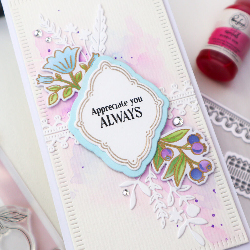
For the watercolor backgrounds, I cut two pieces of mixed media paper to 3″ x 6″ (mini slimline size), then loosely watercolored them using Premium Liquid watercolors – one panel using Bubble Gum, and the other using Lavender and Sky Blue. I kept the color placement diagonal across the panel for a natural flow of the design. Between layers, I dried the panel and continued building color until I was happy with the intensity.
After the panels were dry, I splattered Bubble Gum and Lavender watercolor onto their coordinating panels.
Once dry completely, I die cut both panels using the Blanket Stitch Mini Slimline Rectangle die and foam mounted them onto white mini slimline cardbases.
I die cut two Lace designs from The Stitch Edit: Heritage Lace from white cardstock and added them horizontally across the center of each background panel.
Then I arranged two of the Freshly Picked florals onto each card, adhering them with foam tape over the watercolored areas.
For the layered frame bases, I ink blended two small pieces of white cardstock — one in Sky Blue and the other in Sparkling Rose — and die cut them using the larger base die from the Cottage Frames set.
For the purple-blue card, I stamped the sentiment from the Cottage Frames stamp set in Detail Black ink onto one of the gold embossed frames. I layered it onto the Sky Blue ink blended frame and adhered it to the card.
For the pink card, I used the Cottage Frames Press Plate set, pressing the sentiment in Detail Black. After die cutting it with the coordinating die, I added three additional die cut layers behind it for extra dimension before adhering it onto the cottage frame. This was then layered onto the Sparkling Rose ink blended base and foam mounted to the pink card.
To soften the composition, I die cut small white accent elements using the Bloom of Thanks and Nature’s Narrative dies and tucked them around the florals.
To finish each card, I scattered a few embellishments:
– Ice Clear Drops on the purple-blue card
– Blush Clear Drops on the pink card
When creating watercolor backgrounds, allow the color to develop gradually. Apply soft layers, dry thoroughly between applications, and continue building depth until you achieve a soft, natural flow.
If you’re looking to create multiple cards efficiently, keep the overall structure of your design consistent and vary the decorative elements instead. Mixing and matching the product suites allows you to produce a cohesive collection while giving each card its own distinct character.
Thank you so much for stopping by today!
Wishing you a crafty day!
TaeEun
I participate in the affiliate program of Pinkfresh Studio. It means I earn a small commission at no additional cost to you each time you click through and purchase the product(s) shared here. Thank you for your support 🙂
Your design ideas are always brilliant TaeEun, and they looks so beautiful in the pink and the blue. I love the shape of the sentiment plate, and the flowers set on an angle above and below look lovely. The pretty blanket stitched slimline mats and then the Heritage Lace strips finish the look perfectly. x