Hello everyone! I hope your week is off to a great start!
Today I’m sharing a couple of floral card on the Pinkfresh Stduio blog featuring the Sweet Bloom and Heirloom Patchwork product suites from the Gather & Bloom Release.
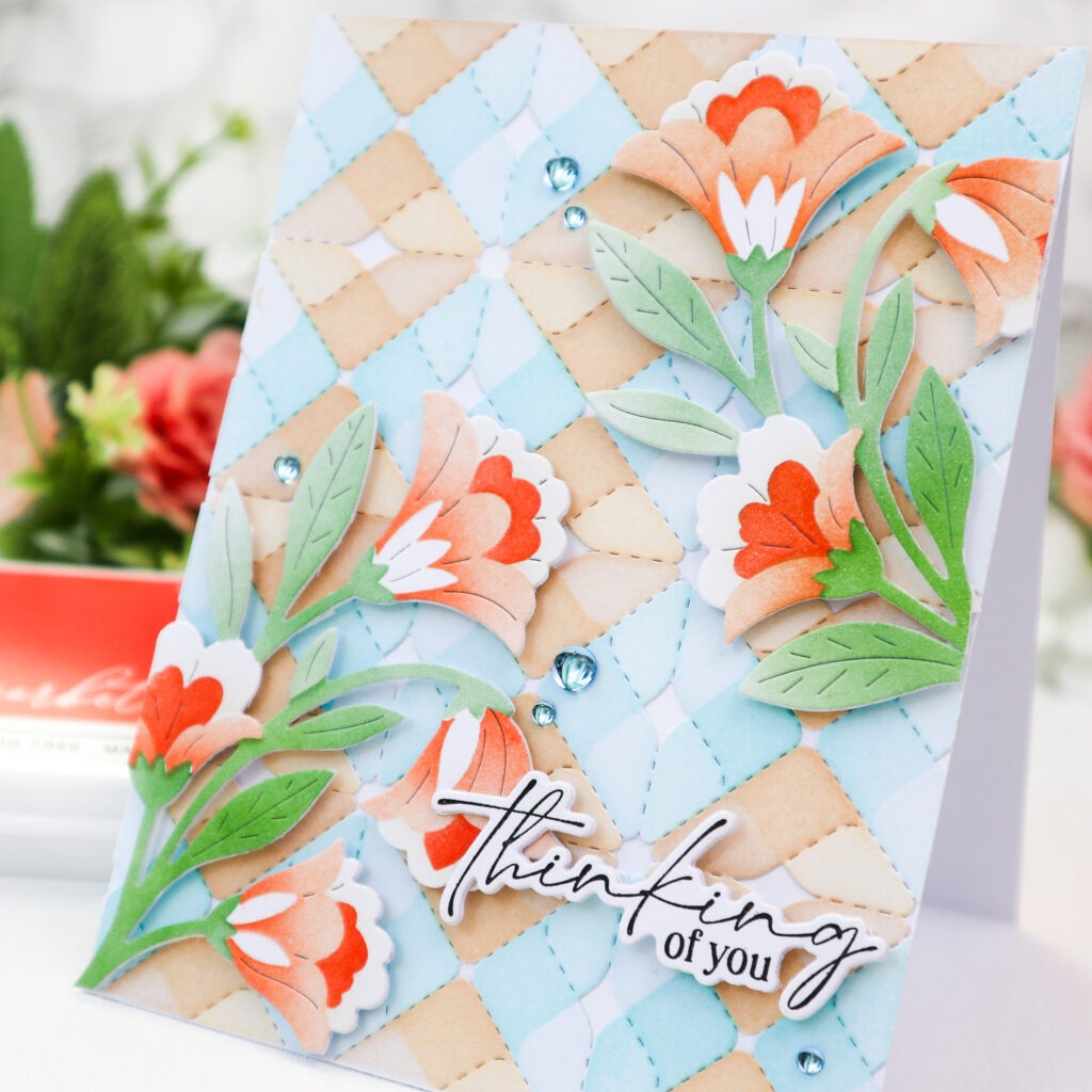
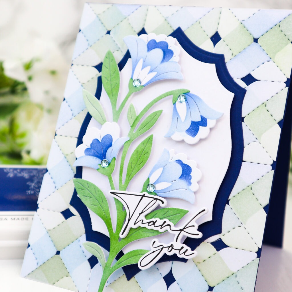
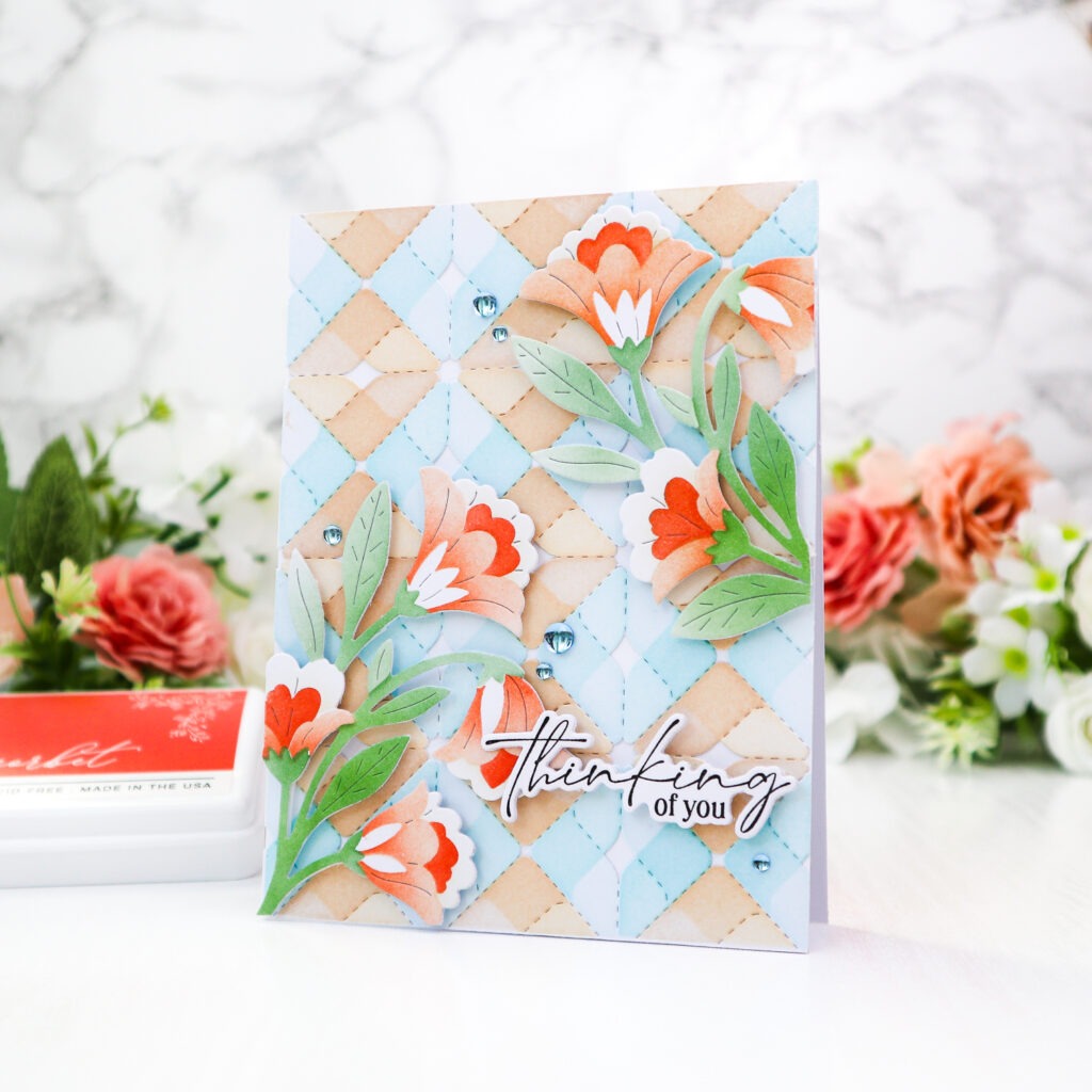
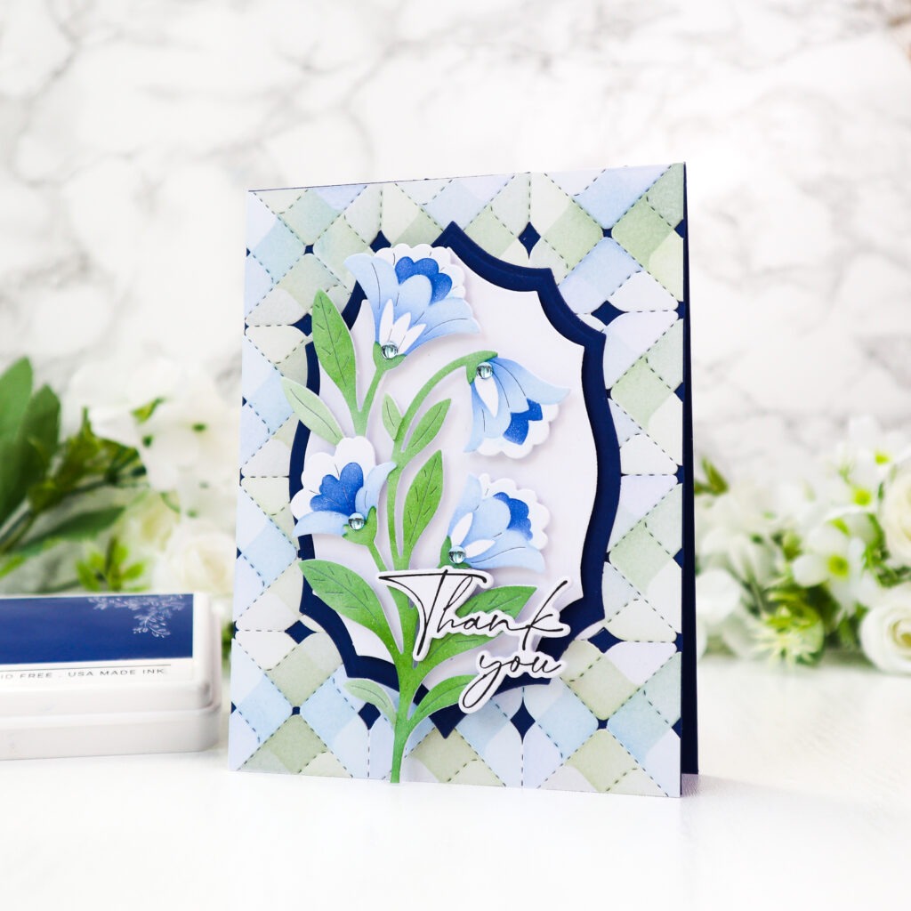
For today’s cards, I wanted to create two different tone-on-tone looks by coordinating the floral colors with the backgrounds; one in a warm palette and the other in a cool palette. I also left portions of the flower petals uncolored while stenciling, which adds contrast and gives the blooms a lighter, more dimensional look.
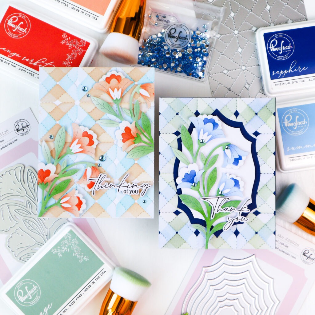
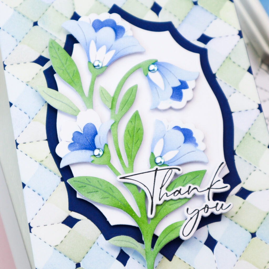
I started by stenciling the Sweet Bloom image three times. Two of the floral images were colored in warm orange tones using Peach Fuzz, Sunkissed, and Mango Sorbet, while the third was colored in cool blue tones with Summer Shower, Slumber, and Sapphire. For the greenery, I kept the colors consistent across all three images, using Sage, Eucalyptus, and Olive.
For the flowers, I applied the lightest shade very softly through Stencil 1, then used the darkest shade with Stencil 2, leaving portions of the base petals uncolored. This helped create more contrast between the layers and kept the flowers from feeling too heavily colored. Then I added the middle shade with Stencil 3.
Once the stenciling was complete, I die cut all the Sweet Bloom images using the coordinating die and set them aside.
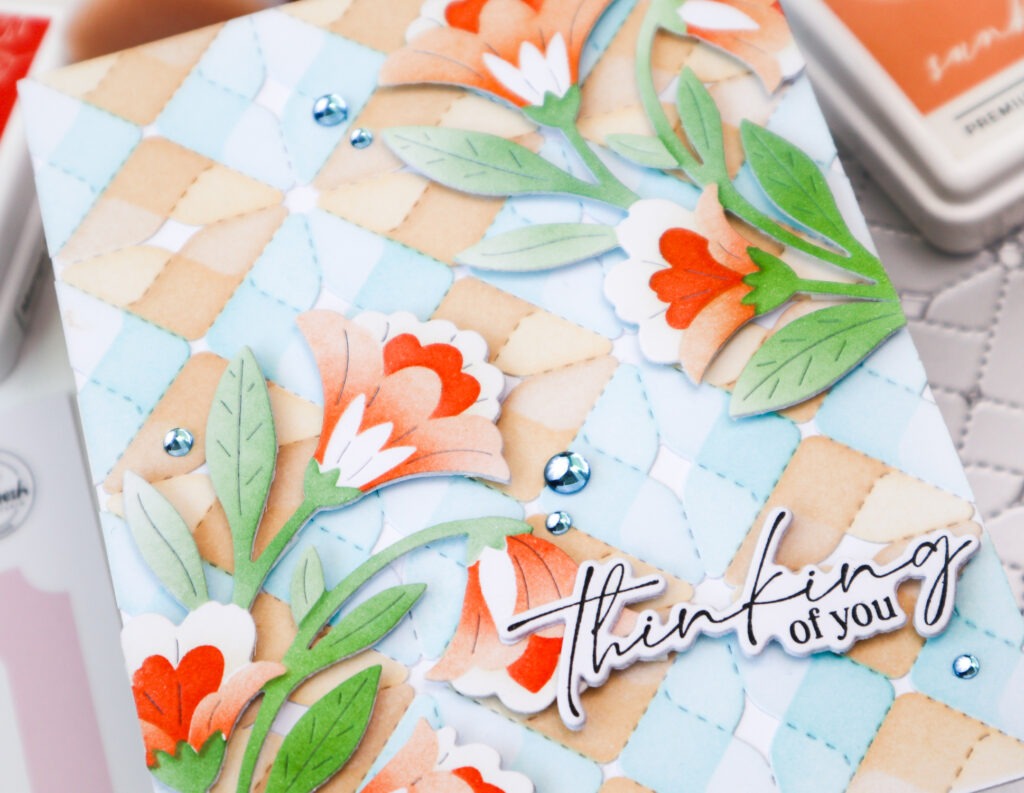
For the backgrounds, I die cut two white panels with the Heirloom Patchwork die and then stenciled them with the coordinating stencil set.
For the warm floral card, I used Sky Blue, Waterfall, Warm Buff, and Peach Fuzz for each stencil, keeping the diagonal color sections more clearly defined so the patchwork pattern remained visible.
For the cool floral card, I used Sky Blue, Slumber, Fresh Pear, and Sage. This time, instead of using one color consistently through each stencil, I switched the blue and green shades across the diagonal sections. This helped break up the obvious diamond shaped color pattern and gave the background a more varied look.
To assemble the warm toned card, I adhered the blue and brown patchwork panel to a white card base and arranged two orange Sweet Bloom images diagonally across the card. I foam mounted them for dimension and trimmed off the excess extending beyond the edges.
For the cool toned card, I adhered the green and blue patchwork panel to a navy card base. I then die cut a larger Heirloom Nested Frame from navy cardstock and a smaller one from white cardstock, layered the two panels together, and added them to the center of the card. The blue Sweet Bloom image was foam mounted on top.
The sentiments on both cards are from the Petite Florals stamp set. I stamped them in Detail Black, die cut them, and stacked each with three additional die cuts for dimension before adding them to the cards.
To finish the designs, I added a few Sky Blue Clear Drops for a subtle touch of shine.
I love how the same floral image can take on such a different feel simply by changing the color temperature. A tone-on-tone palette is an easy way to create a cohesive design.
One small stenciling tip for the flowers is to leave parts of the petals uncolored. This creates more contrast between the layers and keeps the flowers from feeling too heavily colored.
I hope these two cards inspire you to play with different color palettes while using the same design elements!
Thank you so much for stopping by today!
TaeEun
I participate in the affiliate program of Pinkfresh Studio. It means I earn a small commission at no additional cost to you each time you click through and purchase the product(s) shared here. Thank you for your support 🙂 !