Hello and happy Friday, everyone!
Today I’m on the Pinkfresh Studio blog with a couple of fresh and summery cards featuring the Sippable Scenes product suite! This is a such a cool design by my talented teammate Isha, and I love how many mix-und-match possibilities there are in this suite ! You can decorate the bottle or can however you like using the stencils and stamps—perfect for endless creativity !
The stamp set also includes a wide range of sentiments, making it super versatile. The coordinating die set comes with dies for a bottle and a can – So I decided to use both to create cards with a popped-up-background. In both cards, I placed the focal element (bottle or can) flat on the card base and popped up the negative panel with foam tape to add dimension and interest !
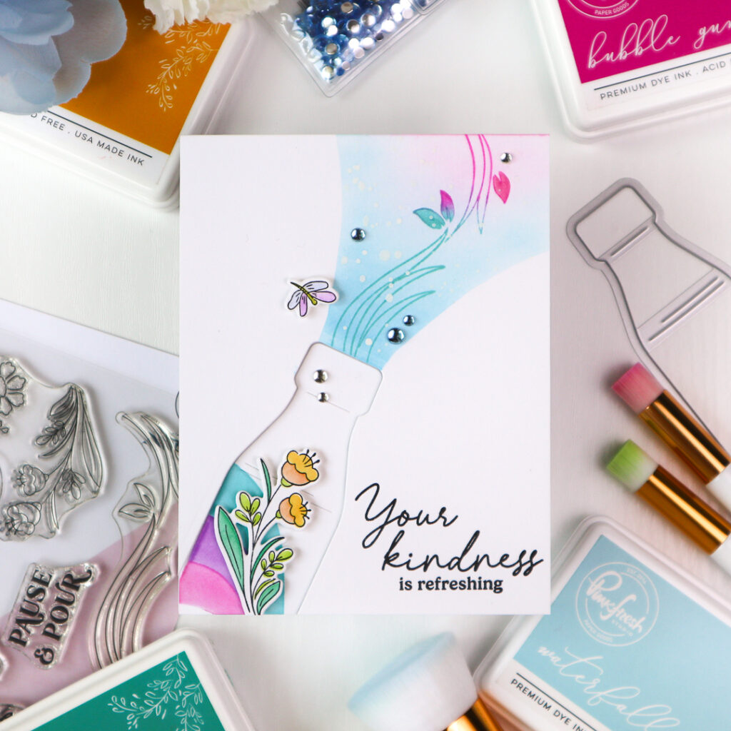
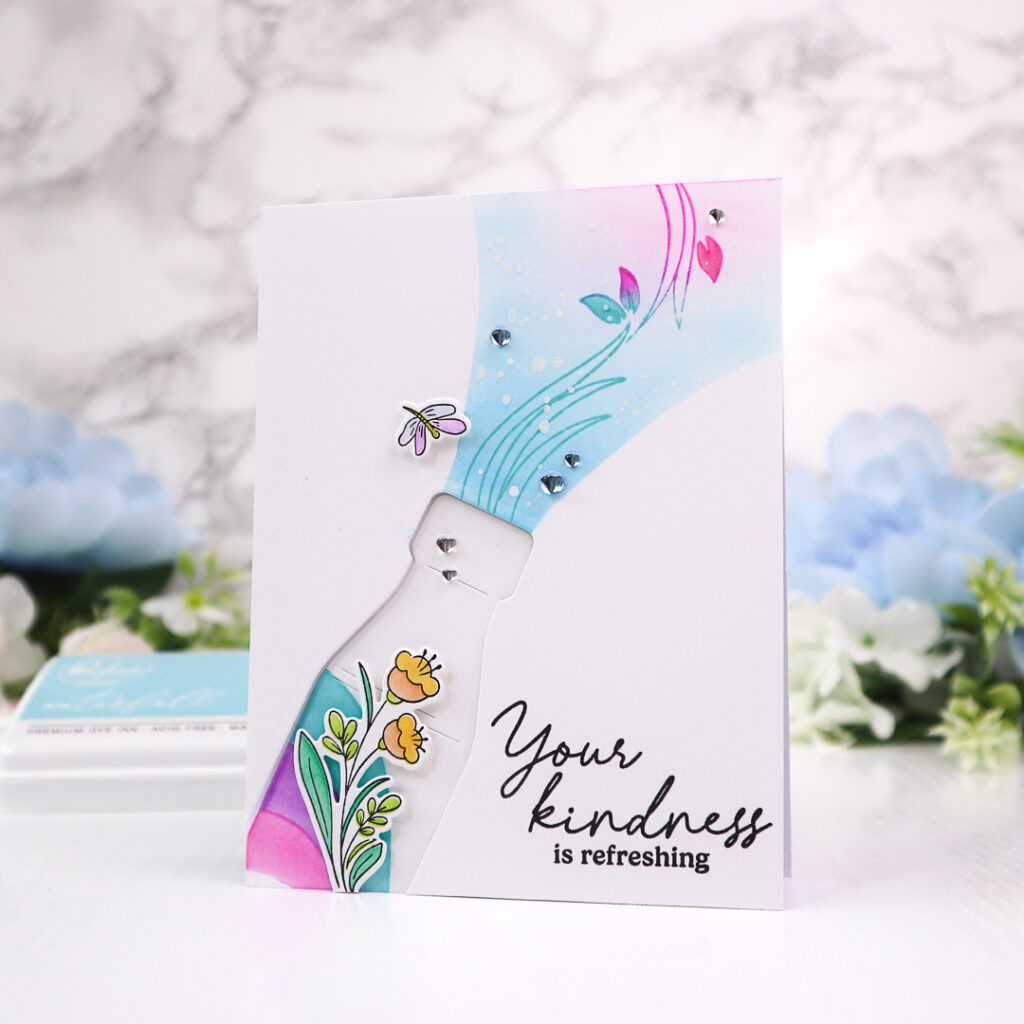
I created the first card using the bottle die from the Sippable Scenes set. I placed the die in the lower left corner so that only a part of the bottle shape would be cut out. I then added a wavy pattern to the bottle using the coordinating stencils, blending Waterfall, Lavender, and Bubble Gum inks.
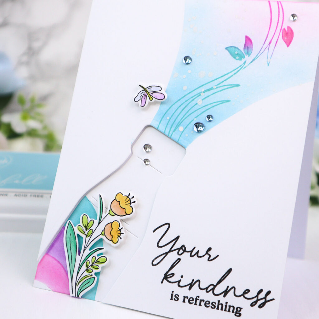
Next I masked off each side of the opening of the bottle on the negative panel using a curved paper masks and softly blended the exposed area in Summer Shower and Sky Blue, adding a hint of Sparkling Rose to the upper right corner. Over this ink-blended background, I stamped the leafy image in Waterfall and Bubble Gum to coordinate with the background. White opaque ink splatters added a light, airy texture. The sentiment was stamped directly onto the negative panel in Detail Black.
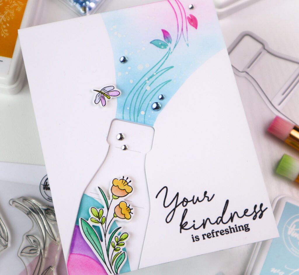
To embellish the card, I stenciled and stamped a small floral cluster and the dragonfly from the stamp set. The flowers were colored in Apricot and Marigold, the leaves in Aquamarine and Grassy Knoll , and the dragonfly in Lavender, Sky Blue, and Marigold. After die-cutting the elements, I assembled the card by adhering the bottle flat onto the card base and mounting the negative panel with foam tape.
To finish off the card I added the flower and dragonfly and scattered a few Sky Blue and Ice Clear Drops for a playful, bubbly effect.
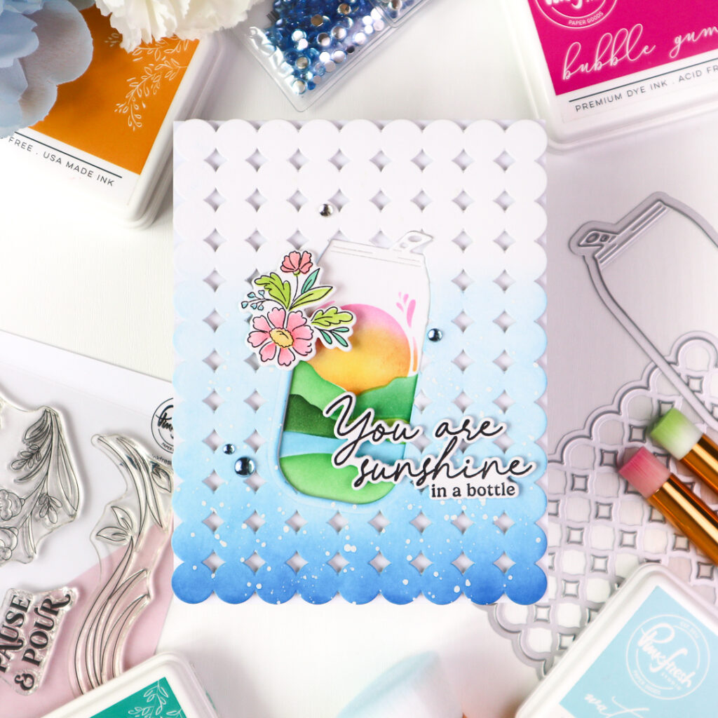
For the second card, I used the can die from the same Sippable Scenes set, this time cutting a white A2 panel with the die placed in the center. Using the coordinating stencils, I built up the landscape scene inside the can—inking it in Meadow, Summer Shower, Evergreen, Key Lime, and Aquamarine. The sun was softly stenciled in Marigold, Apricot, and Sparkling Rose.
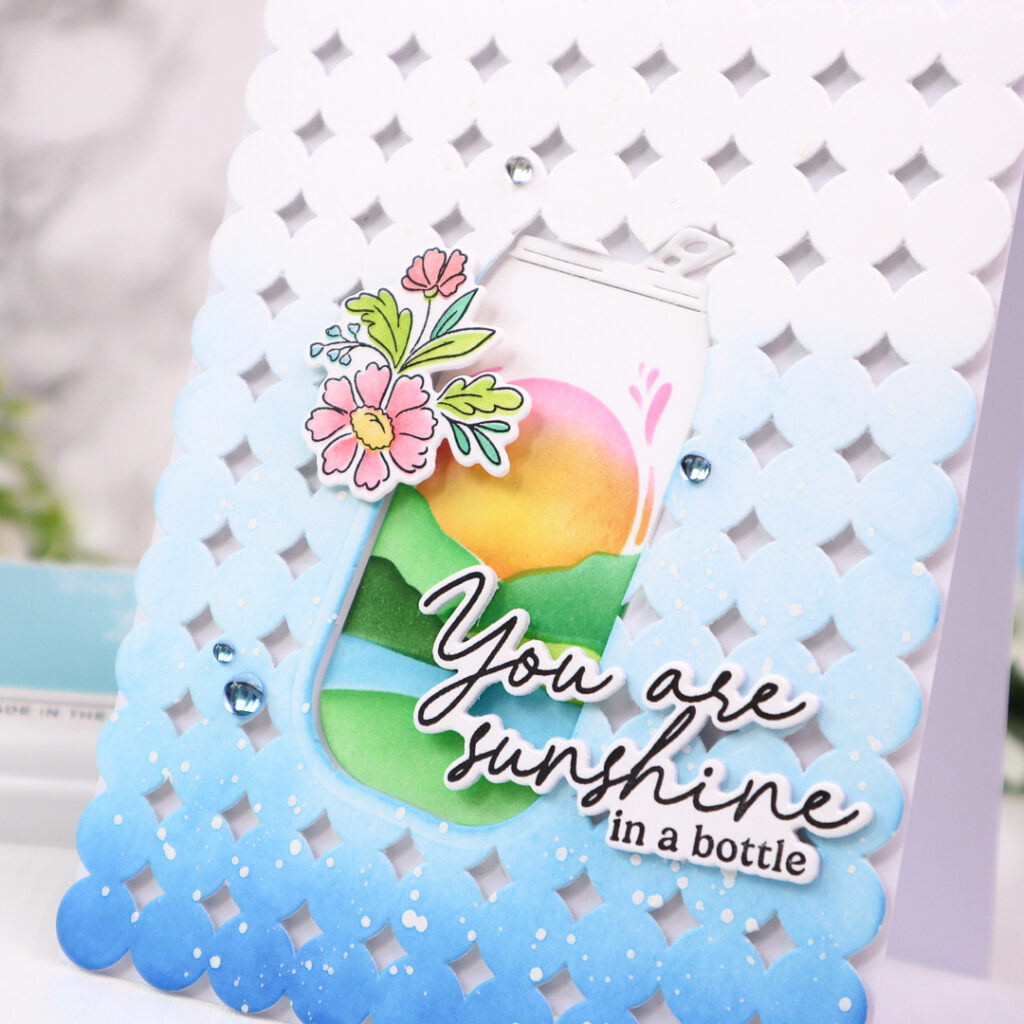
Next, I ink-blended the negative panel to create a backdrop in ombré blue, using Sky Blue, Summer Shower, and Seaside, darkening it toward the bottom while leaving the top third of the panel uncolored. I then cut the negative panel with the Starry Scallops coverplate die and splattered white opaque ink over it for a fresh look.
The small floral element was stenciled in Coral Reef and Apricot (larger flowers), Waterfall (tiny flowers), and Aquamarine and Grassy Knoll (leaves), and then die cut.
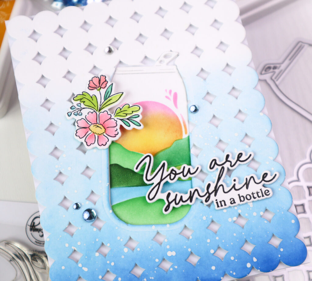
I foam mounted the background panel and inlaid the can flat into its cutout, gently curving the pull-tab upward for added dimension. The sentiment was stamped in Detail Black and die-cut before being placed beside the can. I finished the card by adding the floral cluster to the left of the can and scattering a few Sky Blue and Ice Clear Drops for a fresh touch!
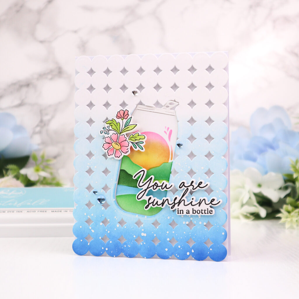
By simply raising the negative panel with foam tape, you naturally frame the focal point and guide the eye toward it. It’s a great technique for highlighting bold shapes while achieving a clean, modern look.
I had so much fun creating these cards with this fabulous set! The Sippable Scenes suite really encourages creative play, and the results are so refreshing—just like a summer drink!
I hope you enjoyed seeing how I made these cards !
Thanks for stopping by!
TaeEun
I participate in the affiliate program of Pinkfresh Studio. It means I earn a small commission at no additional cost to you each time you click through and purchase the product(s) shared here. Thank you for your support 🙂 !

Two wonderful cards TaeEun and the bottle with the negative panel popped up over it looks great and such pretty added flowers and the very pretty look of the liquid pouring out of the bottle in coordinating colours works brilliantly. I love the similar idea only with the can on the second and a great idea to add a lovely scene within it and then the Starry Scallops coverplate in beautiful shades of blue surrounding it over the top and more pretty flowers and a lovely sentiment to finish. This Sippable Scenes set is perfect for bright and beautiful summer cards and yours certainly are. x
Fantastic cards! I really love the ink blending and stamping coming out of the bottle. And that dragonfly!!!!