
Hello everyone! I hope you’re having a wonderful week so far!
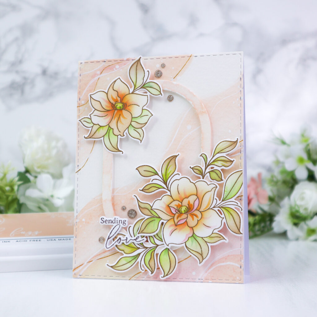
Today I’m on the Pinkfresh Studio blog sharing a floral card in soft, muted colors that give the design an elegant look. This card features the beautiful Floral Daydream product suite from the Daydream Edit Release. To complement the delicate colors of the floral images, I created a soft watercolored background using the Premium Liquid Watercolors Pastel set.
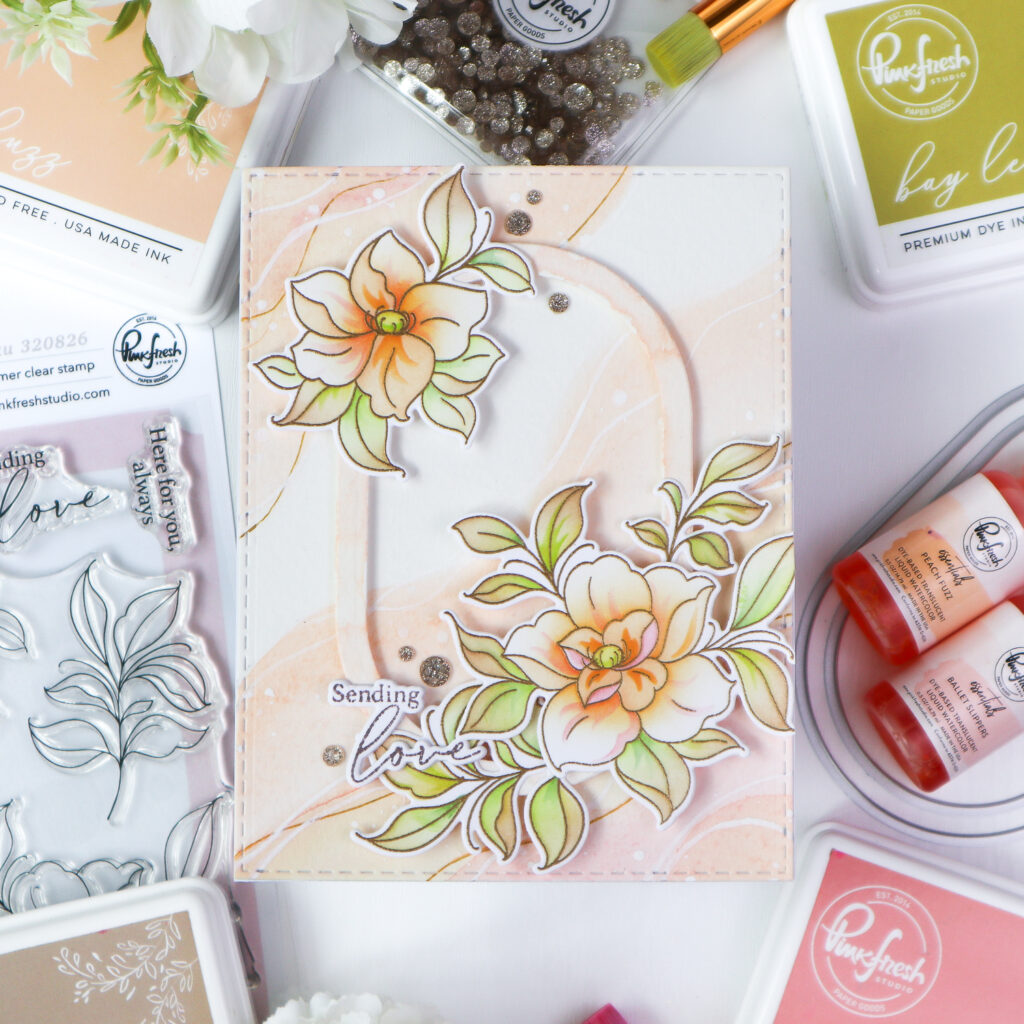
I started by heat embossing the Floral Daydream images in gold on white cardstock. I then colored the images with the coordinating stencil set, using Peach Fuzz, Apricot, and Coral Reef for the flowers, and Grassy Knoll, Bay Leaf, and Warm Buff for the leaves. While stenciling, I kept the bases of the petals and leaves a little darker than the tips to add depth and dimension. Once the coloring was finished, I die cut the florals with the coordinating die.
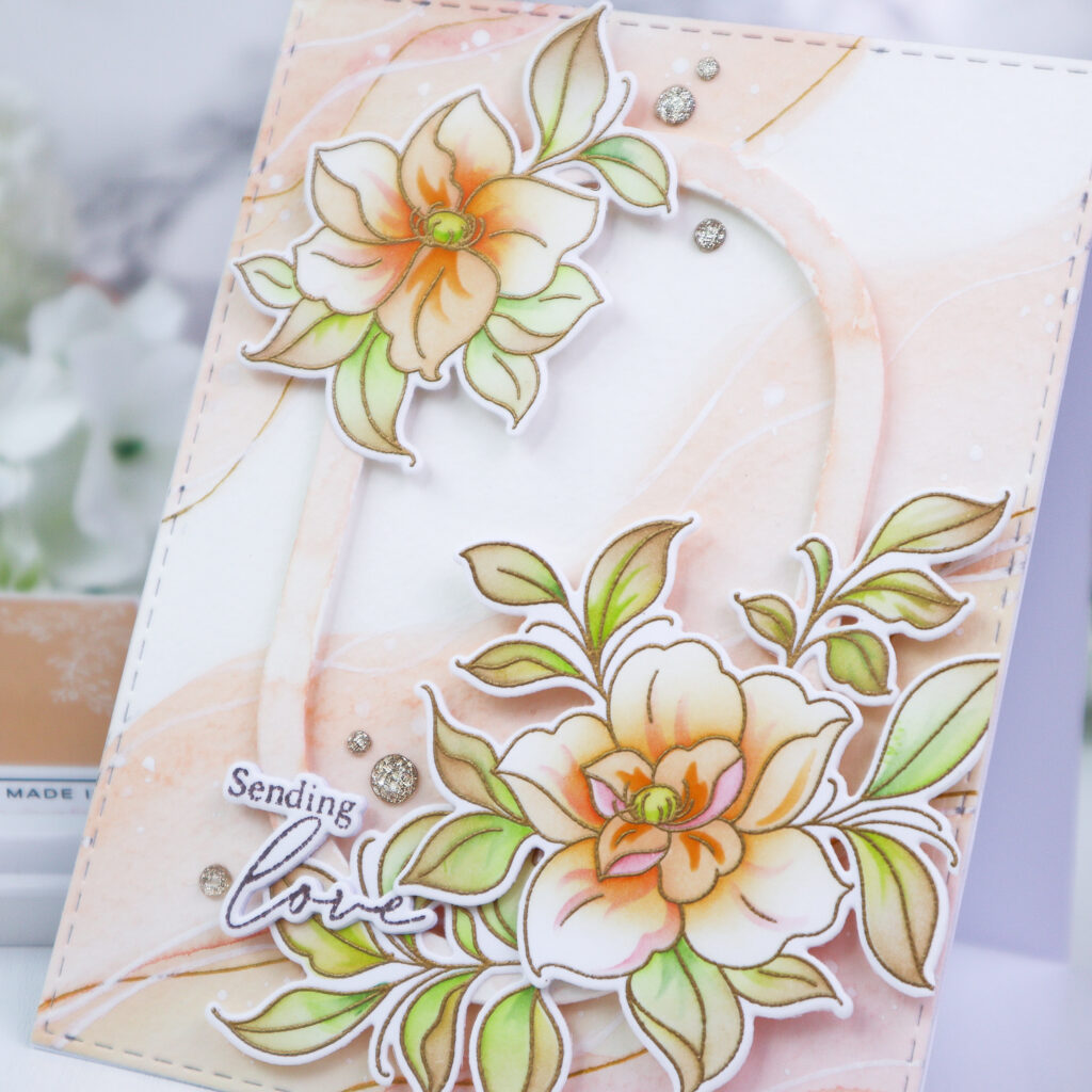
For the background, I watercolored a panel of Premium Watercolor Paper with Peach Fuzz and Ballet Slipper watercolor. Using a wide brush, I painted the colors diagonally in a soft wavy pattern and left some areas uncolored so the background would feel light and airy. After the panel dried completely, I added wavy lines and dots with white and gold gel pens for a little extra detail and interest. I then die cut the background panel with the largest die from the Single Stitch Rectangle die set.
Next, I created the oval frame by die cutting Premium Watercolor Paper with two dies from the Nested Elongated Ovals die set. I watercolored the frame in Peach Fuzz and Ballet Slipper as well, so it would coordinate with the background.
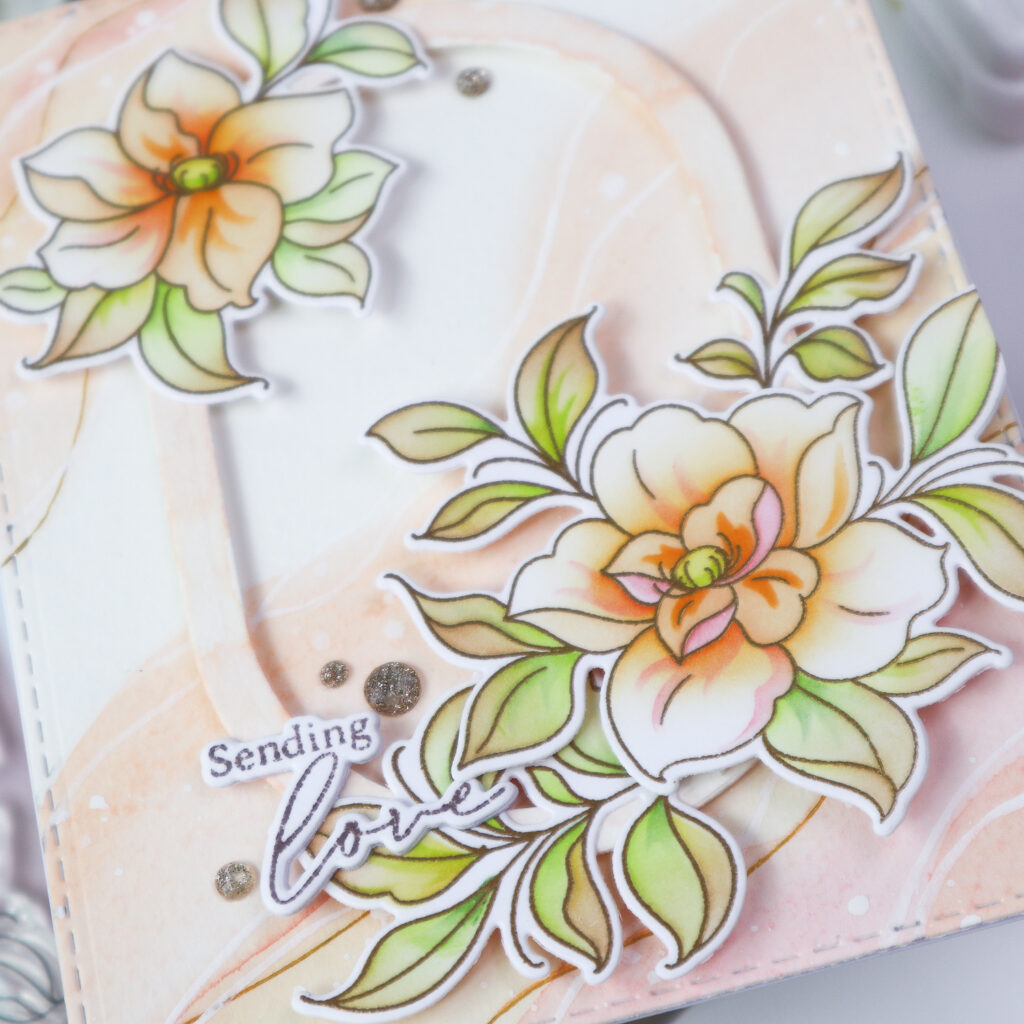
To assemble the card, I adhered the background panel flat onto a white card base and then foam mounted the oval frame in the center. After that, I arranged the floral images along the diagonal corners of the frame using foam tape.
For the sentiment, I pressed it in Espresso using the Floral Daydream Press Plate set, die cut it, and added it to the lower left side of the card. To finish everything off, I embellished the design with a few Champagne Glitter Drops.
When I start making a card, I usually think about the color palette first. The next thing I consider is the background and what kind of look would work best with both the focal point and the color palette. That part often takes me the longest, but I really enjoy the process of bringing everything together. Ink blending and watercoloring are two of my favorite ways to create backgrounds, as they help the overall design feel soft and balanced. What do you usually start with when you make a card?
I hope my card inspired you today!
Thank you so much for stopping by, and I wish you a crafty week ahead!
TaeEun
I participate in the affiliate program of Pinkfresh Studio. It means I earn a small commission at no additional cost to you each time you click through and purchase the product(s) shared here. Thank you for your support 🙂 !
Such a beautiful card! I really love how you used gel pens to add to the background – it looks so pretty!
I love the way you make your backgrounds as the watercolour is very effective and the added frame and flowers in lovely coordinating colours work beautifully TaeEun, and the flowers and leaves are beautifully coloured as always…a terrific card. I also start with the colour choice first and work from there. x