
Hello everyone! Hope you’re having a great week so far!
It’s time for a new challenge at The Flower Challenge. The theme of the month of May is PRETTY PASTELS !
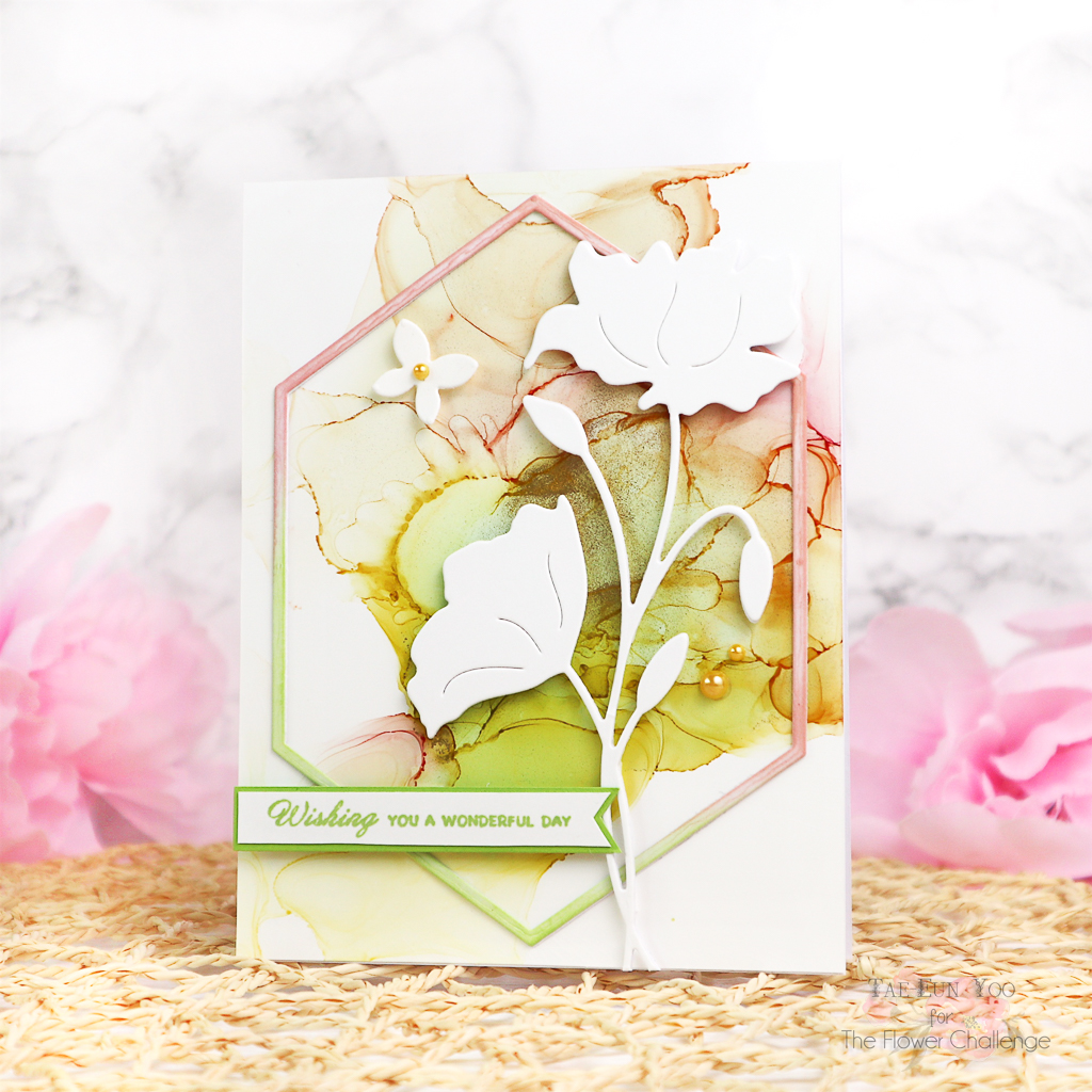
I colored the background of my card in pastel colors and added white die cut flowers of the Finesse (51-769) die by Penny Black.
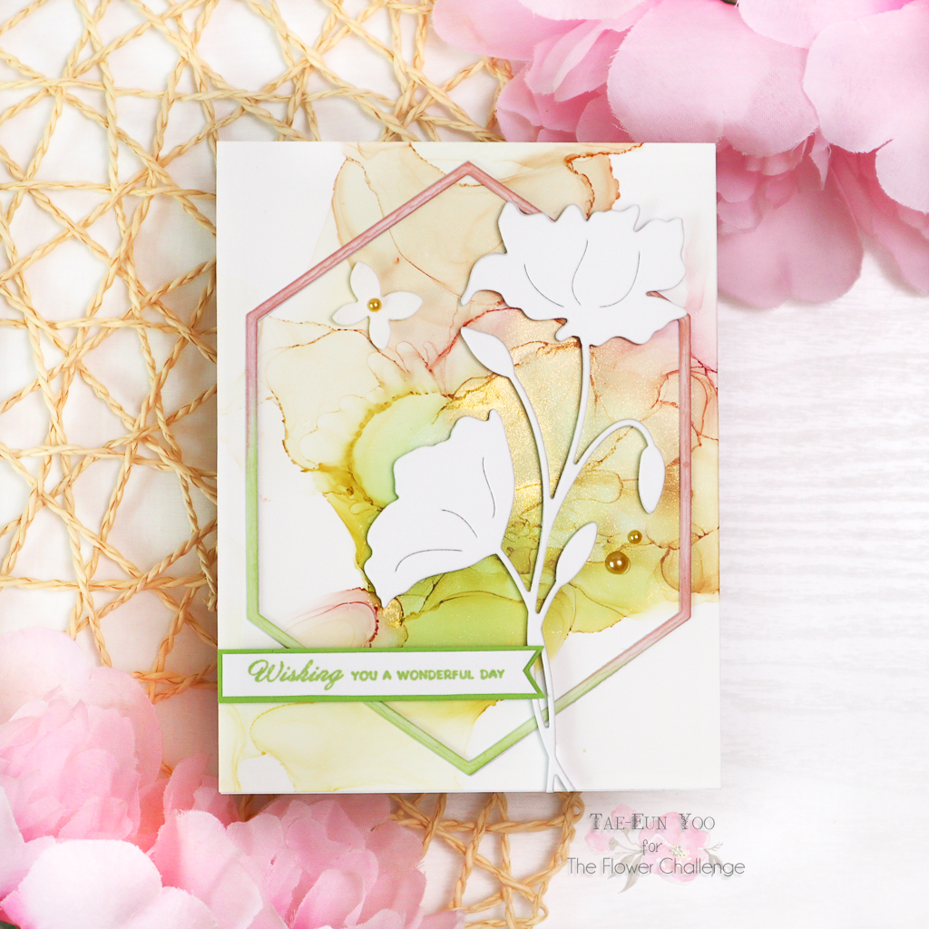
I started by making the alcohol ink background in soft green and pink. I first dropped rubbing alcohol on a Yupo paper and added few droplets of Pink Sherbet and Citrus alcohol ink to it. I also added Piñata Brass to it for some golden accents. I moved the inks using a hair dryer, added rubbing alcohol when I wanted to change the pattern and repeated the process until I was happy with the result. After the panel was dry I adhered it on a white cardbase.
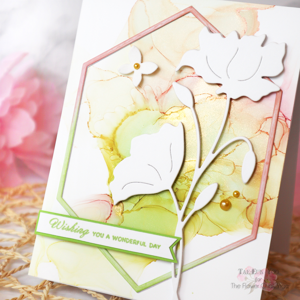
Next I cut a Hexagon Frame (51-640) two times from some white cardstock and ink blended one of them in soft coral and soft green ink. I layered them together and added it to the card.
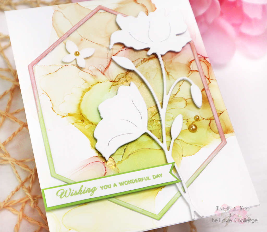
The Finesse (51-769) was cut three times from white cardstock and stacked together for some dimension. I placed it on the hexagon frame using foam tape.
The sentiment is from the Blissful Bears (30-958) stamp set. I stamped it in Matcha ink on a strip of white cardstock, matted it with a strip of light green cardstock and added it to the card.
I also added a small white butterfly which was cut with a die from the Hydrangea (51-610) set. Some golden flat back pearls were my finishing touch for this card.
Now it’s your turn! But before you go creating please stop by The Flower Challenge blog and get more inspiration from the lovely projects that our talented guest Maria PetKash and my team mates have made!
Looking forward to seeing what you will create!
Thank you so much!
TaeEun
I love the soft pastel colors of your alcohol ink background, TaeEun! Wonderful movement and a beautiful way to showcase this awesome die cut!
Such fresh and pretty colours of alcohol inks for the background and echoed in the prettily coloured frame TaeEun, and the white die cut poppies stand out beautifully using three stacked together over the top….a gorgeous card. x
such a beautiful card Tae Eun, love the soft alcohol ink background. truly beautiful design
Your alcohol background is fabulous, TaeEun, and I love that colored diamond that you used to frame it and the white flower silhouette.
I never would have thought to use alcohol inks for a pastel background but yours turned out beautifully TaeEun! The CAS design is so classy and elegant!