Hello everyone! Hope you’re having a great week so far!
Today I’m on the Pinkfresh Studio Blog with a couple of cards featuring the Guiding Light and the Petal Perfection suites from the Sunshine & Smiles Release. I used the scenic image from Guiding Light as the background and arranged the poppy flowers (I think they are! :)) from Petal Perfection in the foreground.
For the first card, I colored the Guiding Light image only partially and lightly to draw attention to the flowers. In the second card, I used soft pastel tones for both the Guiding Light and Petal Perfection elements to create an overall dreamy, delicate look.
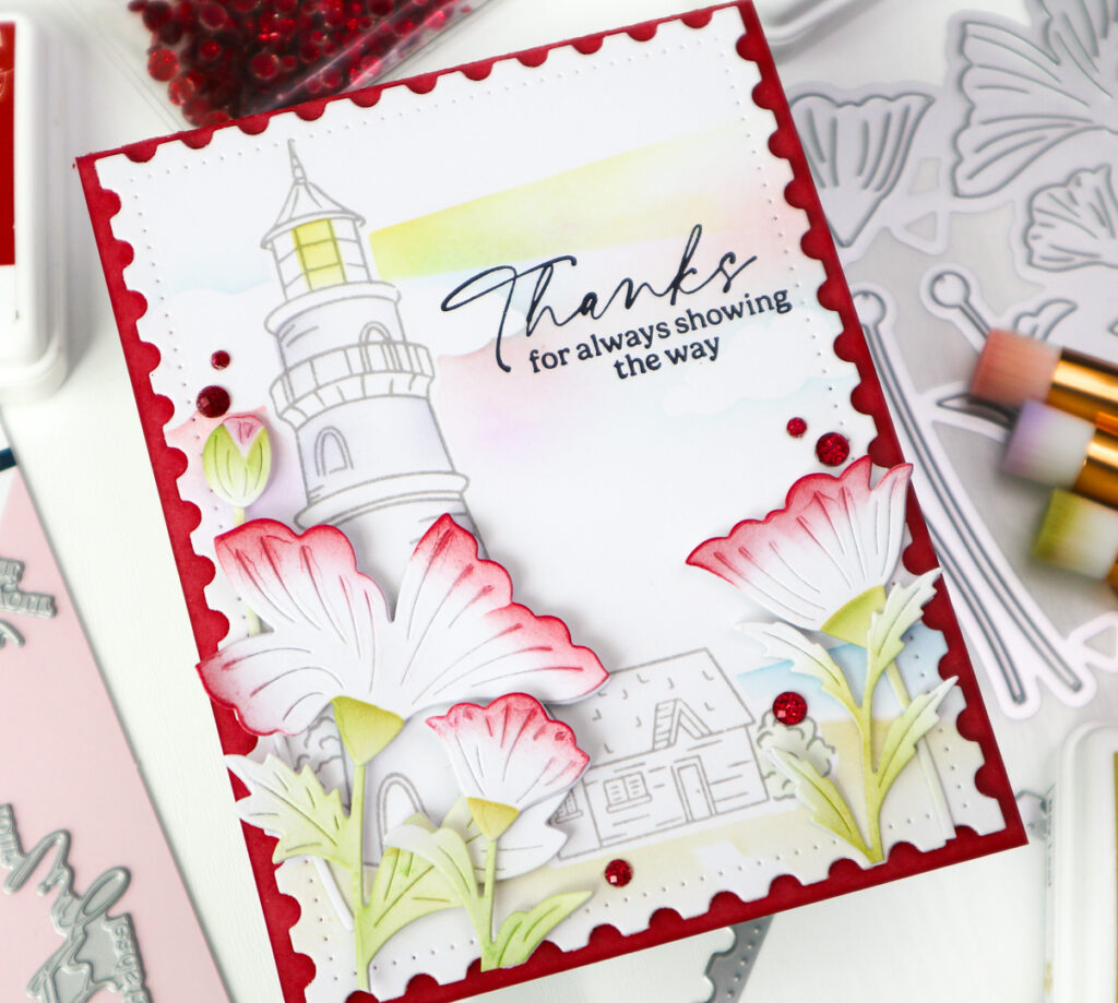
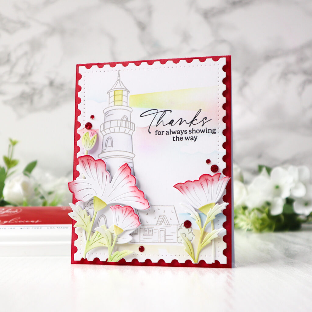
For the first card, I wanted the flowers to be the star of the show.
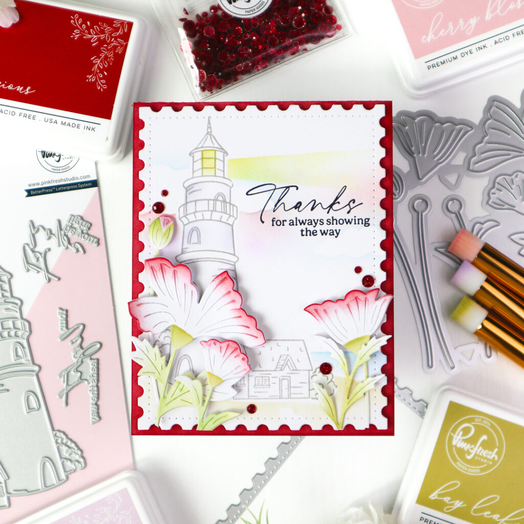
I pressed the Guiding Light image in Rocky Slope and stenciled the panel with the coordinating stencil set. I kept the coloring on the lighthouse minimal—just a hint of Sheer Freesia on the edges and a wash of Sunshine in the beam to bring a gentle glow. I made a mask by die cutting a printer paper with the Guiding Light coordidnating die, cover the pressed image before stenciling the background. The background was stenciled partially and lightly : the sky around the clouds in Lavender, Cherry Blossom and Sky Blue, the sea in Sky Blue and the Ground in Warm Buff and Bay Leaf.
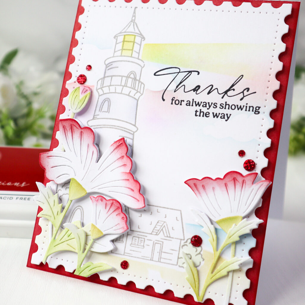
The sentiment was pressed in Detail Black for contrast directly onto the background panel, and I die cut it with a die from the Nested Rectangles: Postage Edge die set. I ink blended the edges of a white cardbase in Berrylicious and foam mounted the backgroud panel onto it.
To bring the florals to life, I stenciled the Petal Perfection blooms in a bold tone—Berrylicious at the tips of the petals while keeping the greenery soft in Bay Leaf and Key Lime. I gently curled their tips for a dimensional look and layered the stenciled petals over clean white die cuts. I arranged the florals on either side of the card. A few Ruby Glitter Drops add the final touch of sparkle.
The second card takes a gentler turn.
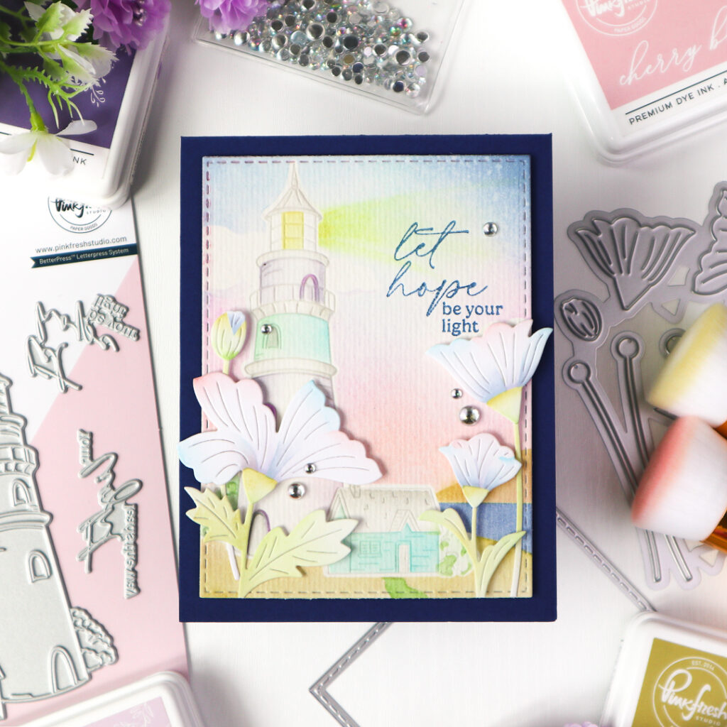
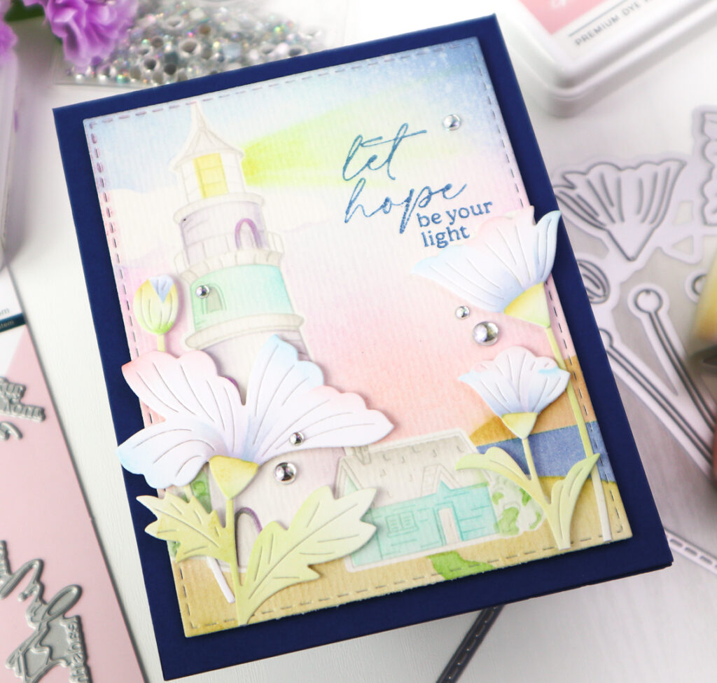
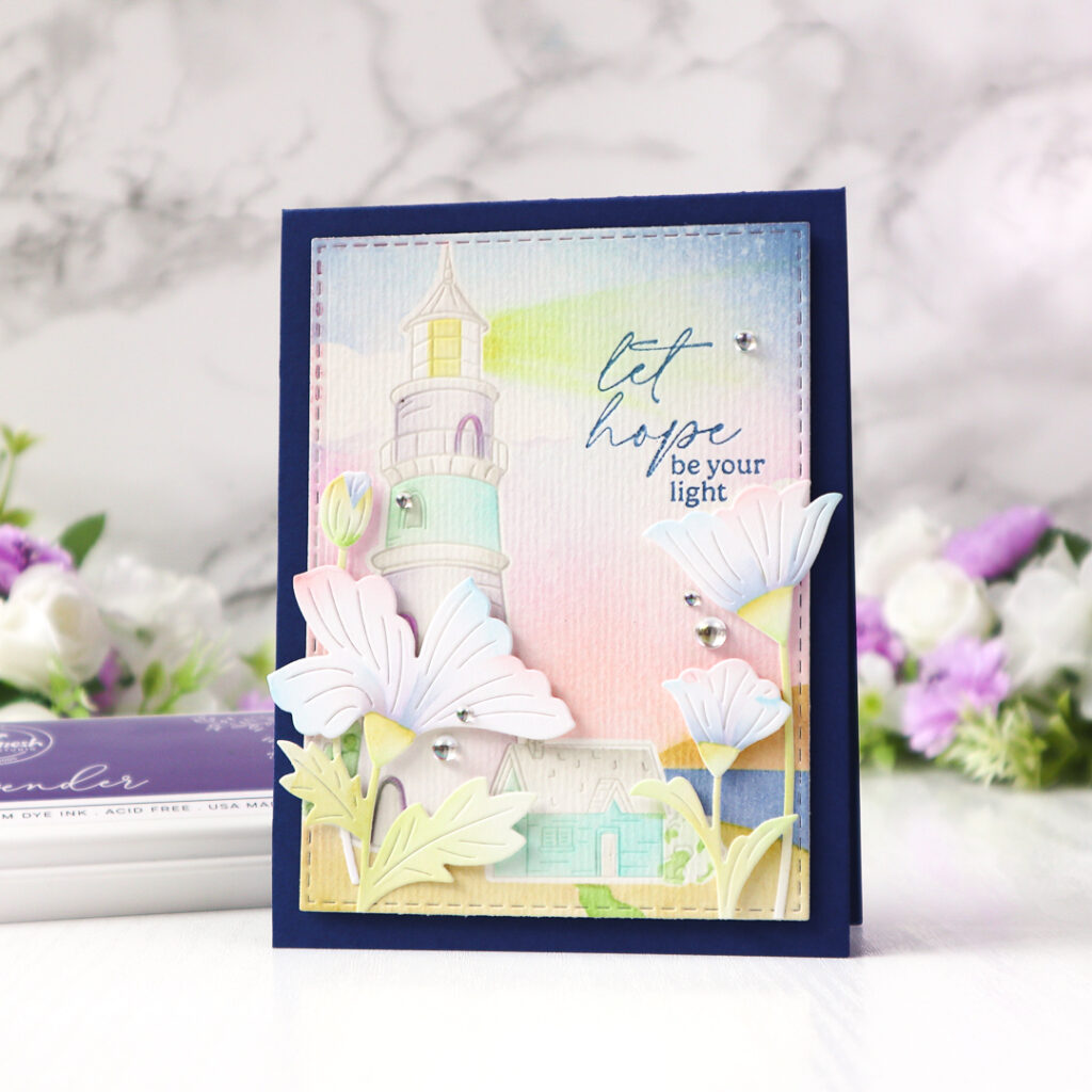
I used the same Guiding Light image, this time pressed in Misty Coast on mixed media paper. After masking the image, I blended a pastel sky using shades like Waterfall, Storm, Lavender, and Cherry Blossom. The surrounding landscape was stenciled also in soft colors : the sea in Storm, the road in Key Lime, and the field in Bay Leaf and Warm Buff.
The lighthouse also was stenciled in muted pastels—Lavender, Mint, Waterfall, and Sheer Freesia—while the beam of light softly glows in Sunshine yellow.
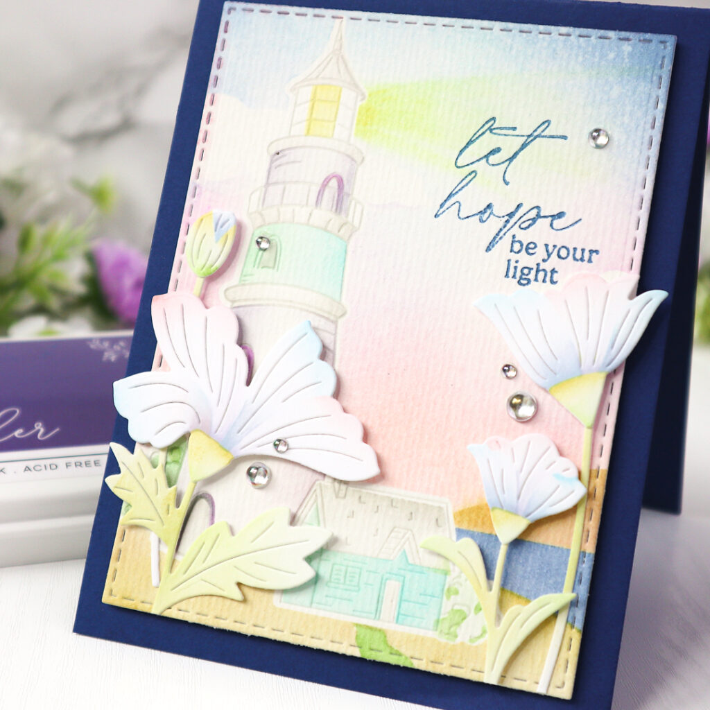
I pressed the sentiment in Storm to match the tone of the card and die cut the panel with a Single Stitch Rectangle die before foam mounting it on a deep navy cardbase.
For the Petal Perfection, I went with a delicate palette as well —Sky Blue, Sheer Freesia, and Cherry Blossom for the blooms, and Bay Leaf and Key Lime for the foliage. The flowers were arranged onto the bottom of the card like the first card. I finished the card with a scattering of Iridescent Clear Drops for a gentle shimmer.
I hope you enjoyed looking at my cards today and found some inspiration for your next crafty session. Don’t be afraid to experiment with colors—whether soft and serene or bold and vibrant, let them tell your story 🙂 !
Thank you so much for stopping by!
Have a crafty day!
TaeEun
I participate in the affiliate program of Pinkfresh Studio. It means I earn a small commission at no additional cost to you each time you click through and purchase the product(s) shared here. Thank you for your support 🙂 .

Two wonderful cards using this great lighthouse design and the pretty die cut flowers TaeEun, and I love the simpler look of the first card with the grey tones and red for the flowers and background and just touch of blue sea and red in the sky, and yellow for the light. In contrast the second has more colour on the lighthouse and surrounding scene and very little colour on the die cut flowers, giving the scene the limelight which is beautiful too. x
Both are so beautiful! I really love the background inking on the second card – those soft colours are gorgeous!