
Hello everyone! ! Today I’m on the Pinkfresh Studio Blog with a couple of adorable cards featuring two brand new product suites from the Delights & Doodles release. The illustrations of this month’s collection are just too cute!!! It’s pure joy to watch the images come to life as the stenciling process unfolds.
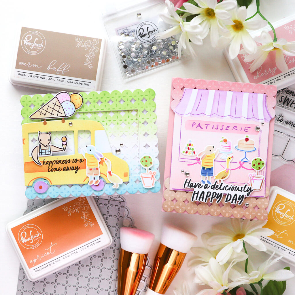
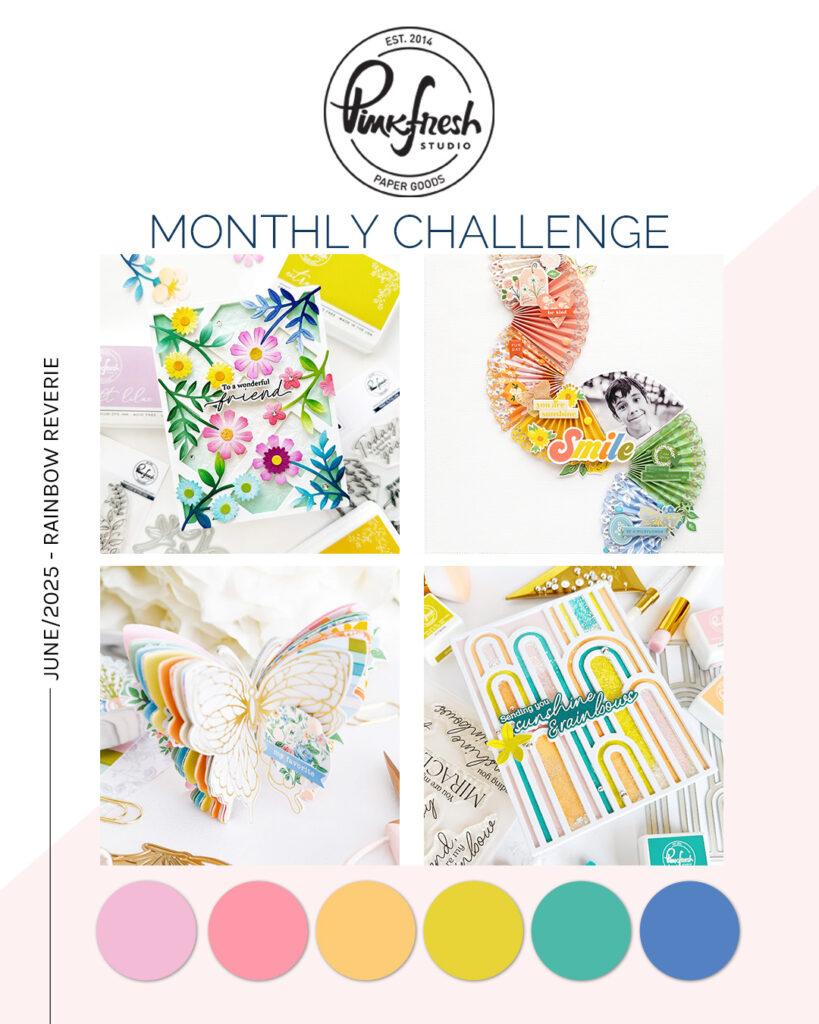
To color all the sweet elements, I used a pastel rainbow palette, inspired by the June Pinkfresh Studio Challenge – Rainbow Reverie .I followed the colors from the challenge palette to tie everything together with a soft, whimsical feel.
For both cards, I created a two-toned-ink-blended background. I like to choose color combinations that evoke natural scenery elements — like the sky, lake, trees, or ground — to add depth and context to the scene. It’s a simple yet effective way to help your focal images really pop!
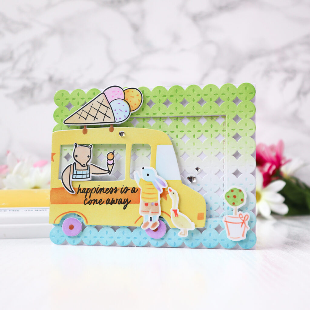
For the first card, I featured the Ice Cream Truck suite and created a charming pastel street scene full of summer sweetness!
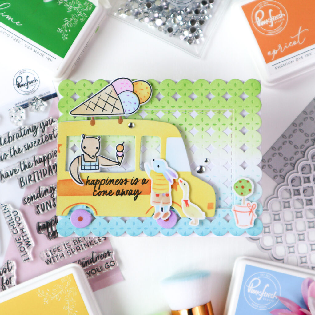
I began by stenciling the adorable images from the Ice Cream Truck suite using soft, cheerful tones.
The ink colors I used are:
– Truck: Sunshine, Apricot, Lavender
– Ice Cream: Sweet Mustard, Sparkling Rose, Sky Blue, Warm Buff
– Bear: Warm Buff, Sky Blue
After stamping the outline in Detail Black, I cut the images using the coordinating die.
To add more playful friends to the scene, I reached for the Patisserie Pals suite. I die cut the bunny, duck, and plant pot from white cardstock. For a fun twist, I created mirror images by flipping the stencils over and inking on the back side of the die cut pieces — a great way to get more out of your supplies!
The ink colors I used are:
– Bunny: Sky Blue, Lavender, Sunshine, Sweet Mustard, Warm Buff
– Duck: Sunshine, Mango Sorbet, Warm Buff
– Plant: Key Lime, Mango Sorbet
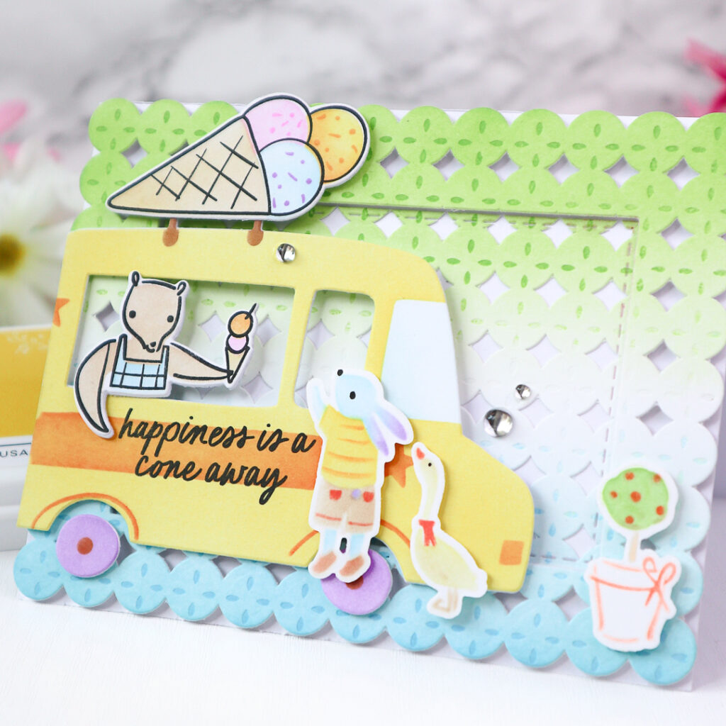
For the background, I ink blended a white A2 panel with Key Lime on the top and Sky Blue on the bottom, creating a soft two-toned base that resembles a lake and trees. To add texture, I pressed the panel using the Petal Grid Press Plate in the same colors I used for ink blending. After that I cut the panel with the Starry Scallops coverplate die and cut it again using a die from the Single Stitch Rectangles die set.
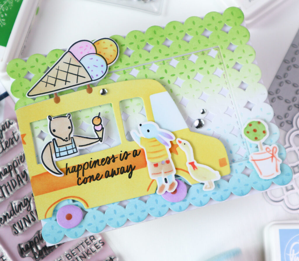
I adhered the central rectangle flat onto a white card base, and foam mounted the frame for added dimension.
I stamped the sentiment directly onto the truck in Detail Black and arranged all the elements as shown. To finish off the card, I added three Ice Clear Drops for that extra sparkle.
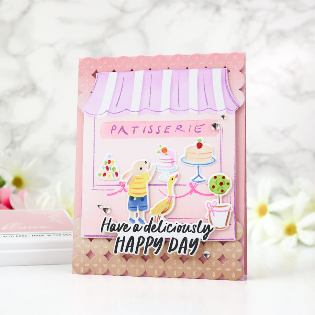
For the second card, I switched to the Patisserie Pals suite with full of delicious little details !
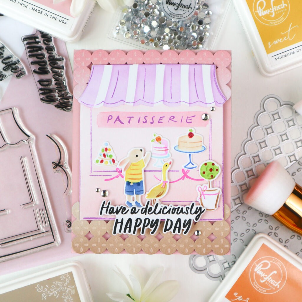
To begin, I stenciled the elements from the Patisserie Pals suite.
The ink colors I used are:
– Patisserie: Cherry Blossom, Peony, Soft Lilac
– Bunny: Peach Fuzz, Bubble Gum, Sweet Mustard, Apricot, Blue Jay
– Duck: Sweet Mustard, Doe, Apricot,
– Plant: Key Lime, Doe, Bubble Gum, Berrylicious
– Cakes : Peach Fuzz, Bubble Gum, Sky Blue, Blue Jay, Berrylicious
I then stamped the patisserie building in Lavender and the ribbon detail in Bubble Gum, then die cut all the elements using the coordinating die.
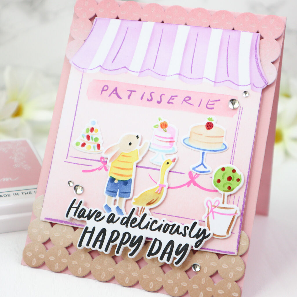
For the background, I again used a two-toned ink blending technique — the top half in soft pinks (Cherry Blossom and Peony) and the bottom half in warm browns (Warm Buff and Doe). I pressed the Petal Grid this time in Calico White and cut the panel using the Starry Scallops coverplate die.
To frame the patisserie scene, I trimmed off the top and bottom parts of the panel and foam mounted them onto a light pink card base.
I then arranged all the cute stenciled elements as shown, added the sentiment, and finished everything off with a few Ice Clear Drops for a sparkling final touch.
Tip1 You can create mirror images using stencils by simply stenciling through the backside. It’s a fun and easy way to stretch the use of your stencils and add a playful twist to your designs.
Tip2 Creating two-toned ink-blended backgrounds is one of my favorite ways to bring depth and context to a card scene. Think about the setting you’re building: sky above, grass or ground below, or perhaps a soft lake meeting a sunset. The gentle blending already adds enough atmosphere to support the images. It’s a small detail that makes a big difference in storytelling through your cards!
Don’t forget to visit Pinkfresh Studio Monthly Challenge Blog for full details and check out the stunning inspiration from my talented team mates!
Happy crafting,
TaeEun
I participate in the affiliate program of Pinkfresh Studio. It means I earn a small commission at no additional cost to you each time you click through and purchase the product(s) shared here. Thank you for your support 🙂 !
Two very pretty cards TaeEun featuring the little rabbit and goose and the ice cream van and patisseries shop front, and the colours reflect the ice cream and cakes them, and the Starry Scallops coverplate die works brilliantly on both and two great sentiments too. x
Such sweet cards! The colours are so beautiful and I love the background die you used! Such great scenes!